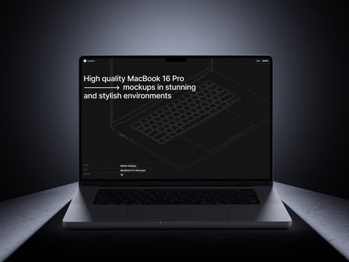
The explosion of no-code and low-code platforms has democratized app development, letting creators build sophisticated applications without writing mountains of code. But here’s the challenge: how do you convince stakeholders, investors, or clients that your Bubble app or Webflow site will look stunning on actual devices? Enter the humble yet powerful MacBook mockup—a visual testing ally that bridges imagination and reality.
Why Visual Context Matters in No-Code Development
When you’re building with drag-and-drop interfaces, the final product exists primarily in browser tabs and builder modes. Sure, preview functions help, but they lack the tangible feel of seeing your dashboard displayed on a sleek aluminum laptop. A MacBook mockup transforms abstract interfaces into something stakeholders can mentally interact with. It answers the unspoken question: “What will this actually look like when someone uses it?”
This psychological shift is massive. Instead of explaining responsive breakpoints, you show your login screen floating on a MacBook Pro’s retina display, complete with realistic shadows and environmental reflections. Suddenly, your prototype feels production-ready.
Testing User Flows Without Writing Code
No-code platforms excel at rapid iteration, and mockups accelerate this further:
- Rapid scenario visualization: Drop different screen states into MacBook mockups to simulate user journeys—from onboarding to checkout—without deploying test environments
- Client feedback loops: Non-technical clients understand mockups instantly, reducing the “I thought it would look different” conversations that plague final reviews
- A/B testing concepts: Compare two dashboard layouts side-by-side in matching mockups to let teams vote on approaches before committing development time
The beauty here is speed. You can test five navigation patterns in MacBook mockups during your morning coffee, whereas coding those variations might consume your entire afternoon.
How Mockups Improve Team Collaboration
Remote teams struggle with alignment—designers, developers, and marketers often visualize different end products. MacBook mockups create a shared visual language that eliminates ambiguity. Instead of vague feedback like “the dashboard feels cluttered,” teammates make precise observations: “The navigation overlaps with the header on this angle.” This surgical feedback accelerates iteration cycles. Mockups also bridge technical knowledge gaps. Your content strategist doesn’t need CSS expertise to recognize awkward button placement in a MacBook mockup, democratizing feedback for better products.
Real Examples of MacBook Mockups in Action
A fintech startup using Adalo recently pitched investors with MacBook mockups showcasing their portfolio management dashboard. They positioned three mockups in a workspace scene—morning light streaming across the screens—demonstrating mobile, tablet, and desktop responsiveness in one image. The result? Seed funding secured within two weeks.
An education platform built on Softr used MacBook mockups during user testing sessions. They displayed student dashboards on mockup screens during Zoom calls, asking beta users to describe what they’d click first. This approach revealed navigation confusion that internal testing missed completely.
MacBook Mockups on ls.graphics: Premium Quality That Elevates Your Presentations
When visual fidelity matters—and in UI testing, it always does—the quality of your mockup resources becomes critical. The MacBook mockup collection on ls.graphics stands out through meticulous attention to detail.
Each mockup features ultra-realistic rendering that captures the precise texture of Apple’s aluminum chassis, the subtle gradient of display brightness, and even the microscopic chamfer on screen edges:
- Smart objects let you drop screenshots with a double-click, eliminating tedious perspective adjustments
- Separate layers for reflections, shadows, and backgrounds give you complete control over composition and lighting
- Multiple viewing angles suit various presentation contexts—from top-down views for UI density comparisons to angled perspectives for hero images
Color styles range from classic silver to space gray, letting you match brand aesthetics. The stylish minimalistic compositions avoid distracting elements, keeping focus squarely on your interface. Perhaps most importantly, these mockups are very easy to use—the process is intuitive: open, insert, export.
Conclusion
MacBook mockups have evolved from presentation polish to genuine testing tools for the no-code revolution. They provide the visual context that helps teams identify UI problems, accelerate stakeholder buy-in, and simulate real-world usage scenarios—all without deploying a single line of backend code. In a landscape where speed and iteration define success, these visual assets aren’t optional luxuries; they’re strategic necessities that transform how we validate, communicate, and refine digital products.


